Basemap Redesign in onX Backcountry
At onX Backcountry we’re constantly innovating, whether we’re on the cutting edge of creating Avalanche Terrain maps and analysis tools or reimagining the way our customers interact with maps. For the last six months our cartographic team has been hard at work, creating a major cartographic redesign of the Backcountry basemaps. We’re extremely proud of this redesign and wanted to show you how we approached this large overhaul and how we arrived at some of our decisions from a design perspective.
First Step: Identify the Cartographic Objectives
We launched into this initiative with a brainstorming session as a cartography team to identify three primary areas of knowledge to drive our cartographic direction.
- What are our onX Backcountry customers trying to do in the app?
- How do we surface the best content we currently have to our customers?
- How do we solve crucial customer problems through cartography?
The Results:
- We identified several key objectives that onX Backcountry users have:
- Discover where they can go for a given activity
- Learn about Terrain and Conditions
- Plan their adventure
- Navigate and Track during their adventure
- We identified several spatial data assets that onX Backcountry does really well such as guidebook content for backcountry skiing, rich trail content for Hiking, Biking, and Climbing, and accurate government land data. There are also supplemental datasets that we continue to improve such as recreation points of interest and base trails.
- Finally, we arrived at some “cartographic conclusions” on what we should emphasize and let steer our design direction:
- An emphasis on our guidebook content as this is what we want to really showcase to our users.
- Simplify and Focus the map so it’s not as noisy and helps the user focus on the aspects of the map important to them: recreation in the outdoors.
- Establish a visual hierarchy emphasizing the most relevant aspects of the map for outdoor recreation and exploration.
- Beautiful Basics: hillshade, contours, landcover that are visually pleasing and have a more dominant aspect of the base data. We want this map to really focus a user’s attention on the natural world.
Second Step: A new starting point
In order to establish a “brand” of cartography we want our maps to share some common traits, while also catering the design to fit the customer’s needs regardless of their activity type. To do this, we wanted to initiate our design work from the ground up. We built a “greyscale” basemap template that could be styled to achieve the visual hierarchy and color palette that best suits the given activity.
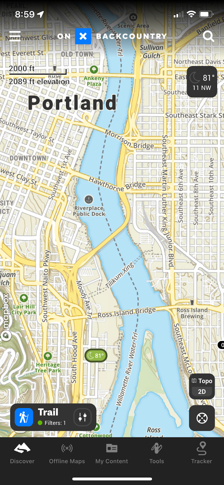
Third Step: The Topo Redesign
Color Palette
We wanted a color palette for the topo basemap that better represented the natural world, but was also more subdued and pleasing to the eye. We identified in our cartographic objectives that we wanted to be able to emphasize guidebook content and government lands in our new visual hierarchy so the colors of the topo basemap, and the strength of their contrast, would really dictate how well we define that visual hierarchy.
Old color palette of topo basemap:

New color palette of topo basemap:

Visual Hierarchy
The visual hierarchy is largely a representation of what we deem the most important information on the map. It brings focus to the chaos of spatial data and helps the user of the map hone in on what is most important given the purpose of the map. For onX Backcountry, we already established that guidebook level content, Government Lands, Trails, Recreation Points of Interest, and a strong representation of the natural world were the most important components of the topo map.
Lower Zoom Levels
Knowing those five important components of the map, we can start to de-emphasize certain features of the map as well, leveraging our ability to change the visual strength of certain map elements throughout the zoom levels. In lower zoom levels (the viewer is zoomed further out) we really want to de-emphasize road networks and put the focus on public lands and our “area labels” to hone in on areas we have a lot of rich trail content.
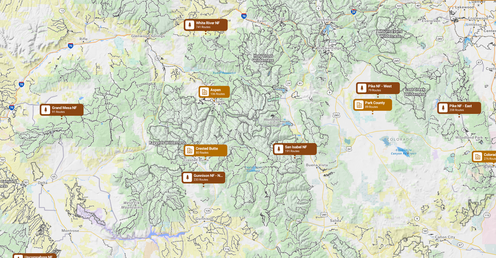
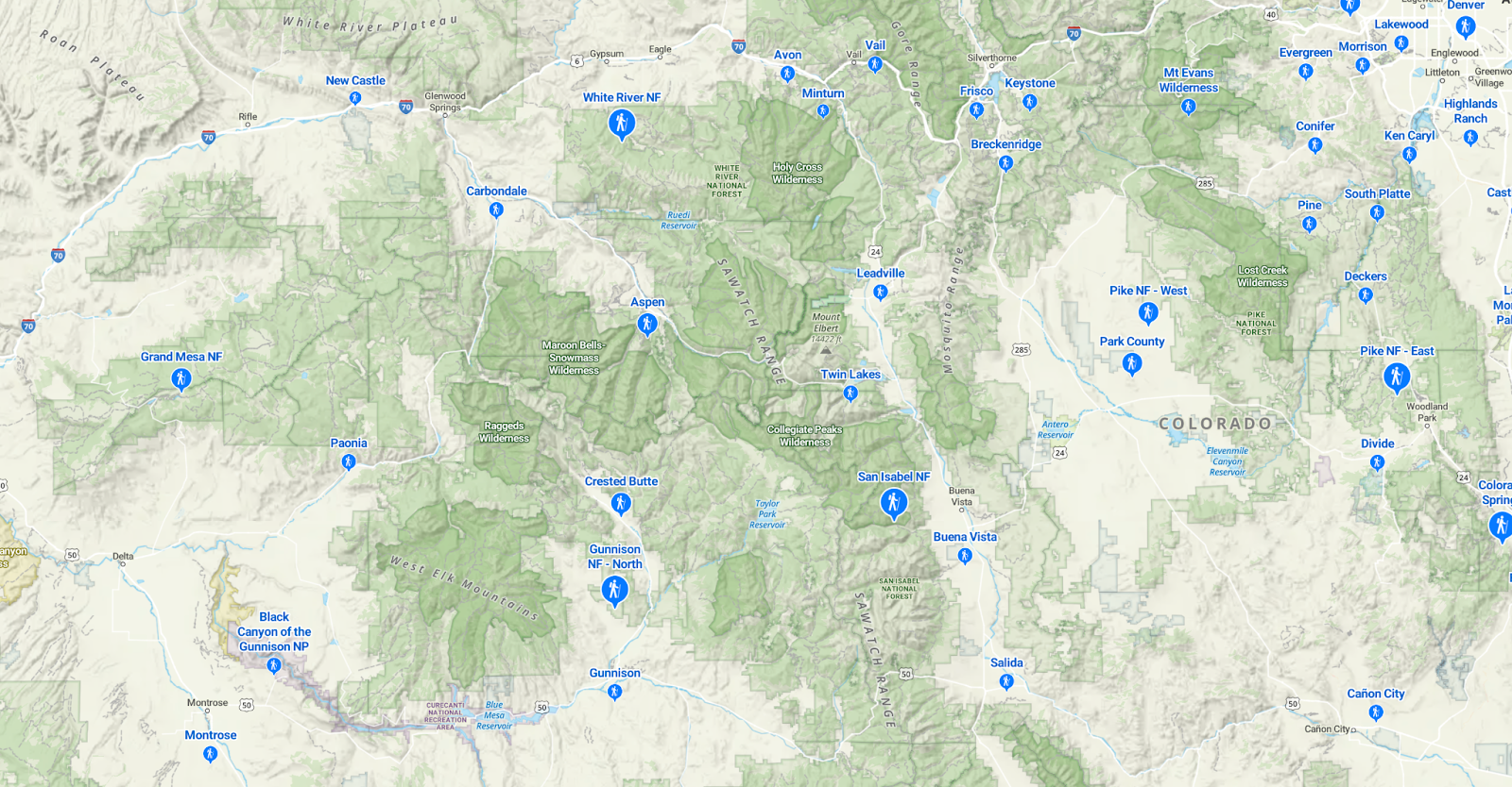
The old map: Major roads really stand out and much of the map is obscured by large area labels
The new map: Roads are de-emphasized and public lands are elevated. We also designed a new “Activity Area” pin to be activity specific, on-brand for onX Backcountry and cover up less of the map real estate
We also applied more of a visual hierarchy to populated places to make the map easier to read in more densely populated areas such as the eastern United States. This, in combination with our redesigned activity area pins, really focused the map and helped emphasize even more the guidebook content that onX Backcountry provides.
Higher Zoom Levels
One of the cartographic challenges for onX is creating a map that emphasizes a certain focus such as a specific activity, while also having the utility of a map that can be used in the field executing a given objective. This is a challenging balance to strike and we try to achieve that balance by really leaning into how we emphasize certain aspects of the map as you get higher into the zoom (zoomed further in).
At these higher zoom levels things like the road network become more important, points of interest start to appear and need their own visual hierarchy, base trails mix with guidebook content trails. We no longer want to cover the map with public land colors, but lean more heavily on the borders themselves so as to not obscure or distract the map and really open it up for the user to accomplish their objectives.
Transportation Network
Roads:
We wanted the road network to not take a front and center emphasis on the map, but become useful in navigating to the trailhead and help in identifying different road classifications. We accomplished this by toning down the use of color and leaning more heavily on road width and casing strengths, trying to paint a very obvious picture of the road classification hierarchy.
Without Update:
With Update:
It’s all in the details: Applying subtle additions like drop shadows to bridges really brings the road network to life and paints a more realistic interpretation of what the map user sees on the ground.
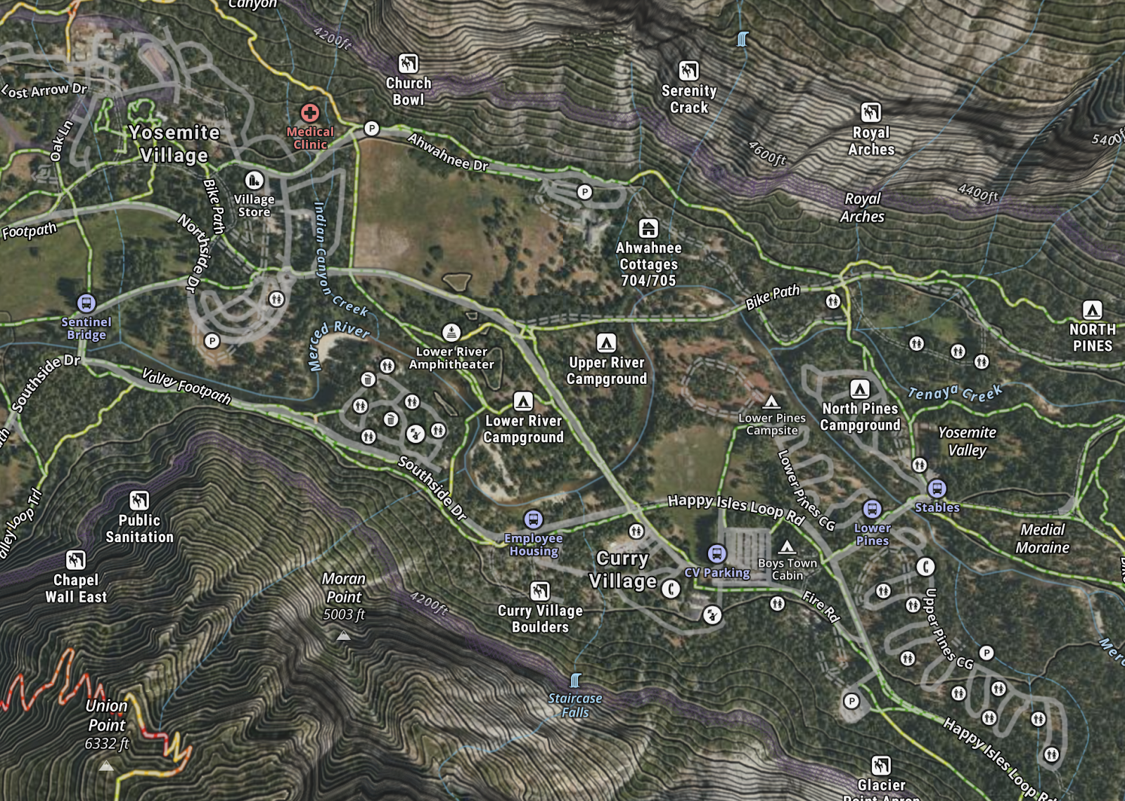
Trails:
This is one of the most important aspects of the onX Backcountry product. It’s a trail-centric mapping application with rich and detailed trail information. How we display that in a clean and informative way is a challenge. We identified at the outset that our hiking-specific trail content had the most engagement. Our base trails are also very important especially where we don’t have coverage of guidebook level trails. To strike a balance between these two competing datasets depended again on the Visual Hierarchy.
We de-emphasized the visual prominence of the base trails, especially at lower zoom levels, to give priority to the guidebook level content trails. As the user of the map zooms further in, the base trails increase in visual strength, but still play a secondary role to the rich guidebook level content trails. This also allowed us to lean more heavily into the area labels to pull customer’s attention to the locations where we have rich trail information.
With
Without
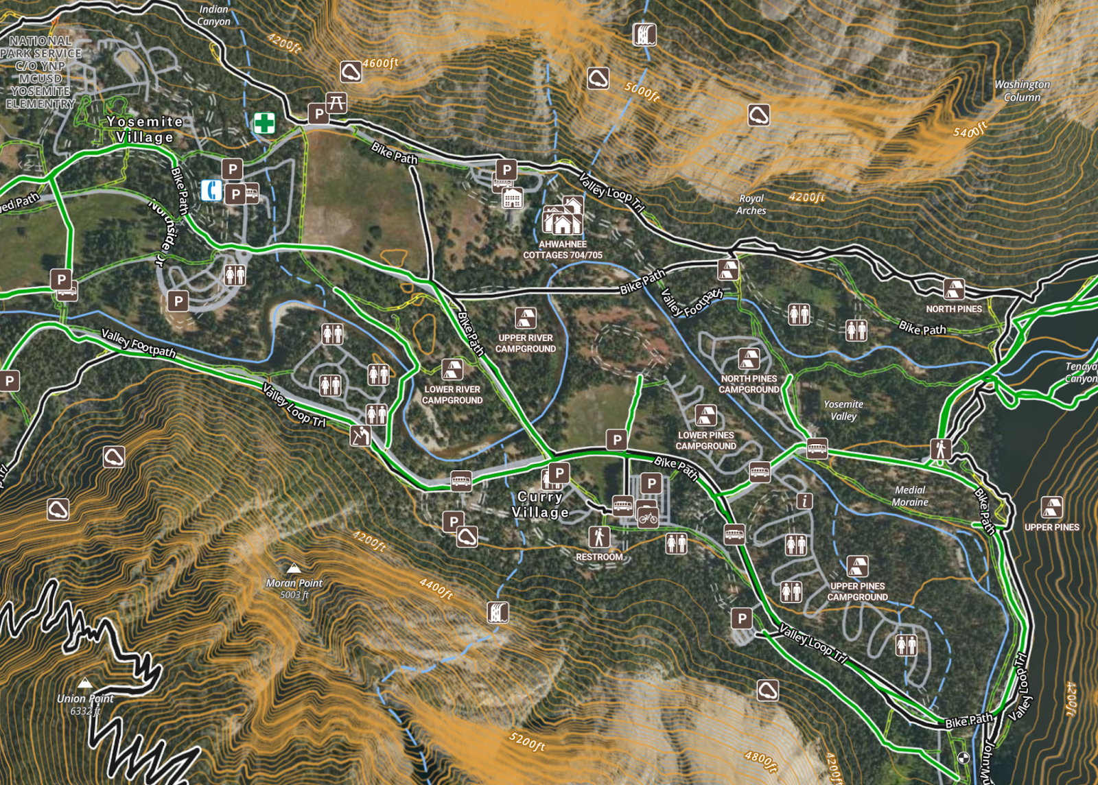
Recreation Points of Interest
To take this a step further, we developed “symbol fonts” from our set of icons. By rendering the symbols as a font on the map it opens up our ability to change size and color on the fly while maintaining pixel perfect clarity. The variants in the symbols allows us to change which version we display for different activity types across verticals and to color them based on similar themes.

Government Lands
Earlier on we identified government lands as one of the primary pieces of spatial content that onX Backcountry has and does really well. From a cartographic design perspective these lands really drive one of the founding principles we want to achieve with our map: a focus on the natural world.
Lower Zooms Levels:
For the redesign we wanted to take a different approach to the visualization of government lands in onX Backcountry. The onX map has historically been very lands heavy in the visual prominence, with lots of colors and fill patterns to display ownership types. For onX Backcountry, we wanted to step into the shoes of a backcountry user and really hone in on what is most important to them for the activities that bring people to onX Backcountry. We consolidated some classifications land types (those with less of a trail-centric outdoor recreation focus), and suppressed some other land types to appear as the user zooms further into the map. This allowed for a cleaner view and opened us to accentuating the styles of wilderness areas, national forests and national parks for lower zoom levels
Without Update:
With Update:
Higher Zoom Levels:
As the user of the map zooms further in, we wanted to shift the map away from strong fill colors and lean more heavily on borders. At higher zoom levels, for the user of the map it’s less about discovery and more about utility, as in how useful the map is in the field. Fill colors and patterns obscure important map elements like trails, roads, points of interest and the terrain. We transitioned the map from fills to borders with inner glows and border patterns as the user zooms deeper into the map.
Without Update:
With Update:
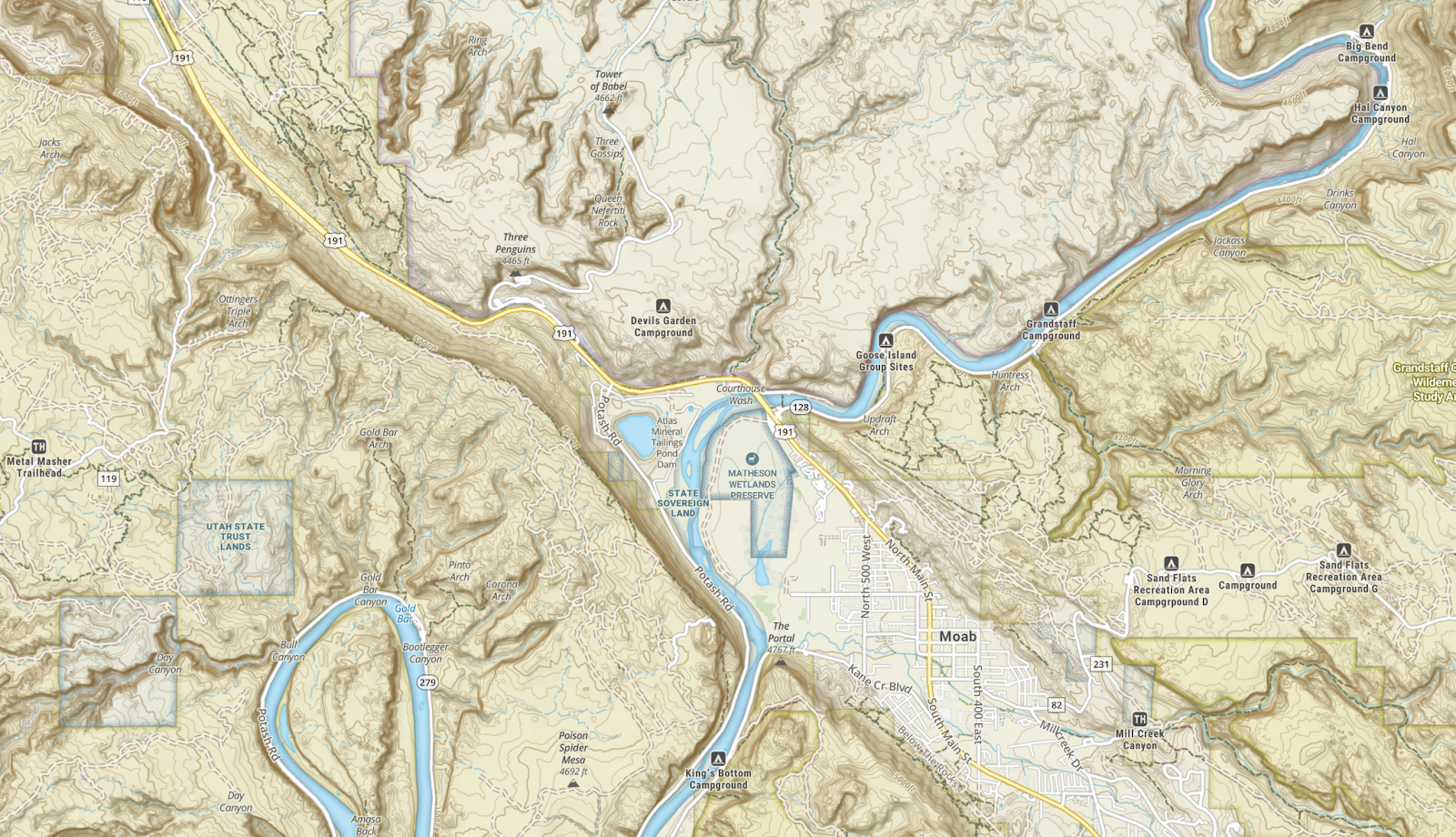
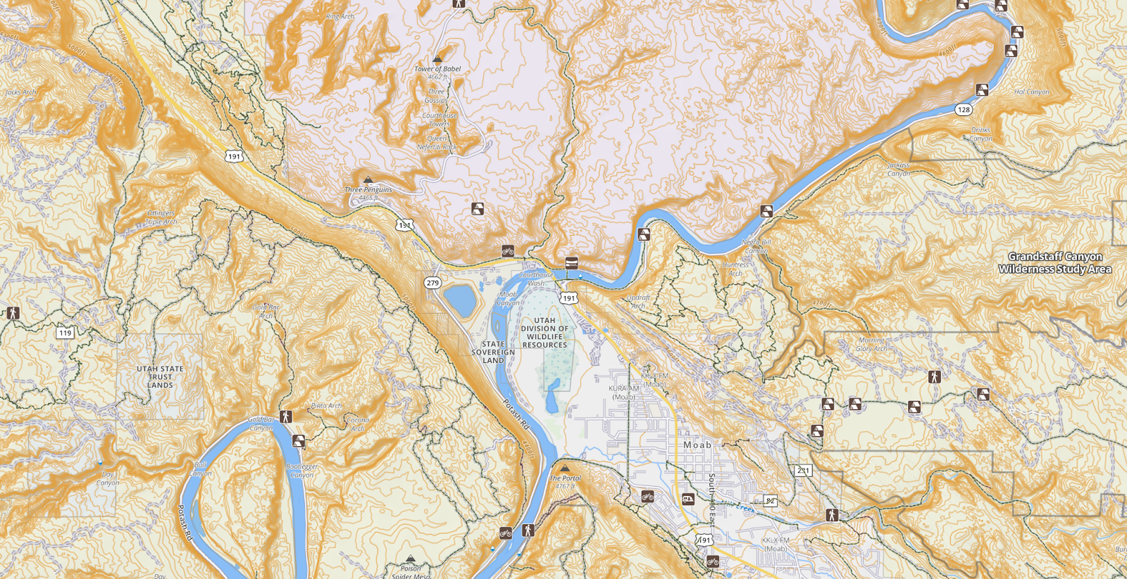
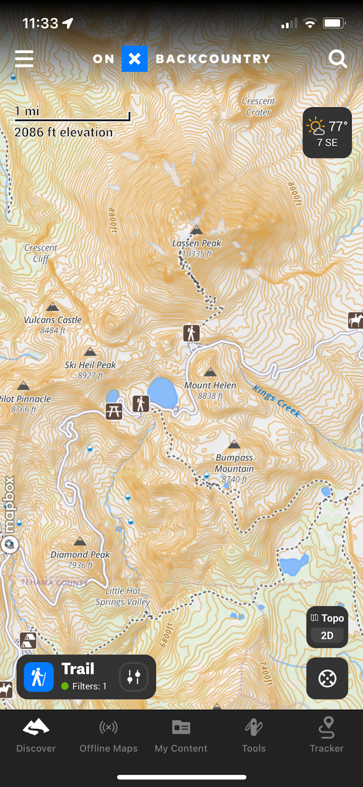
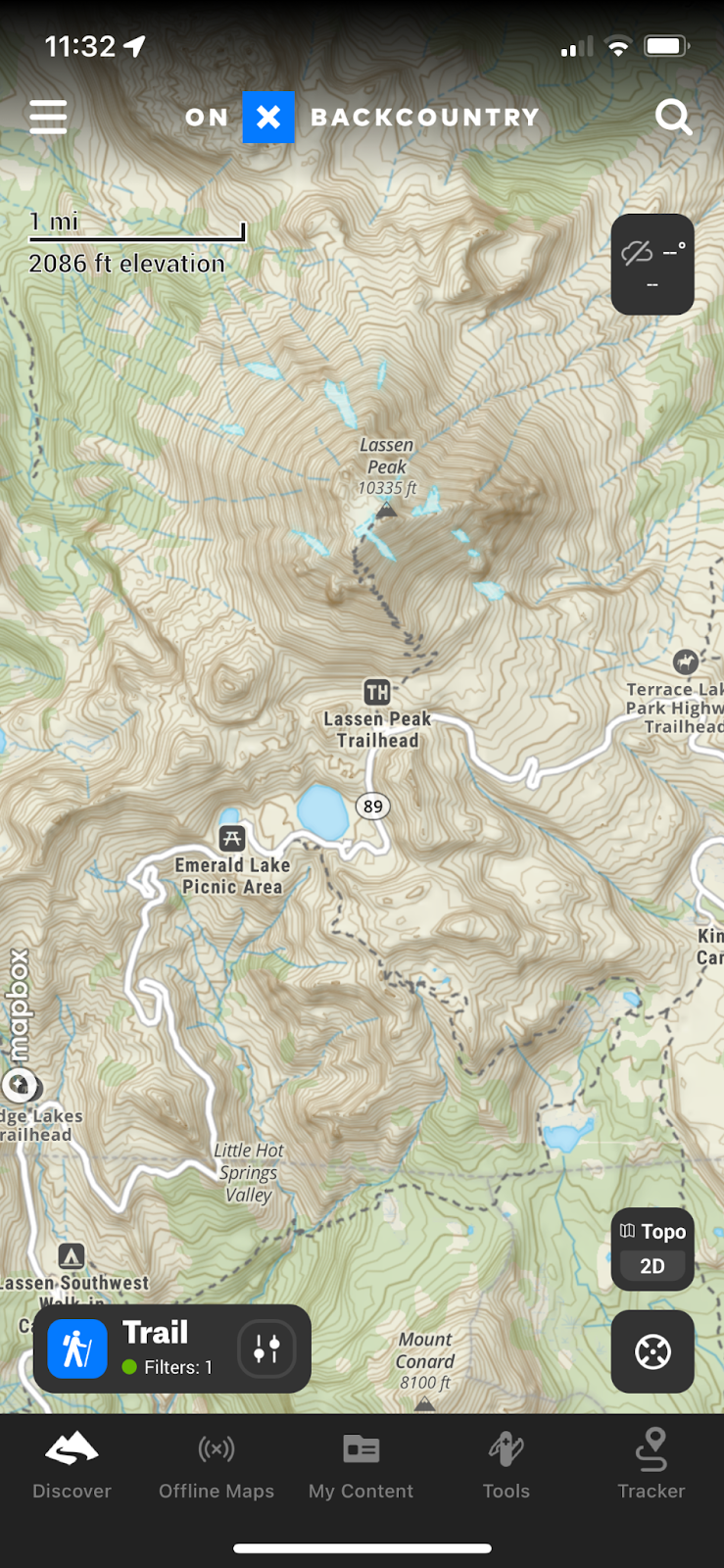
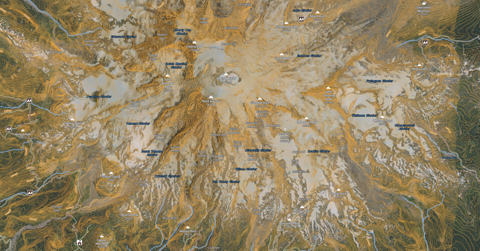
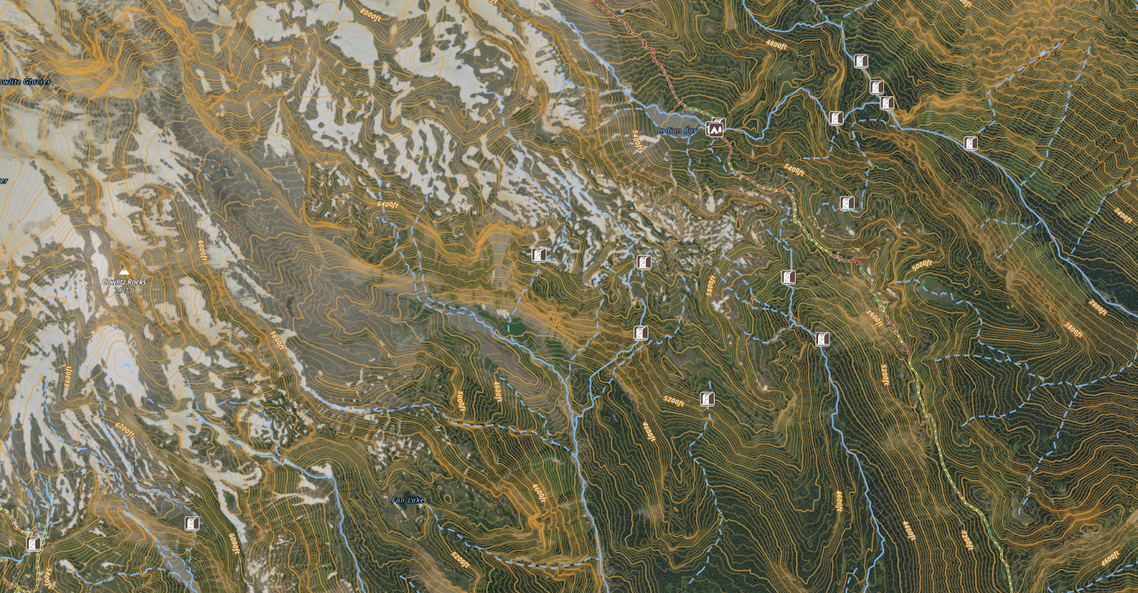
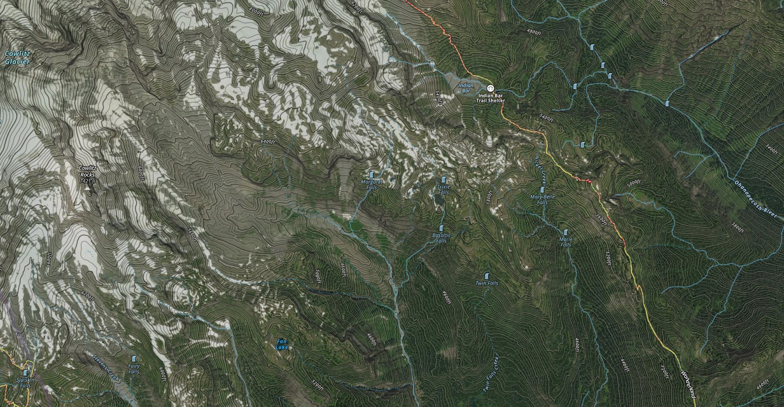
Contours, Landcover and Hillshade
During the first step of this redesign we identified one of the primary objectives of users of the onX Backcountry product is learning about Terrain and Conditions. We concluded that our map should focus on “Beautiful Basics” which means really nailing the look and feel of the terrain, including the forest cover, to paint a detailed and enjoyable picture of the topography.
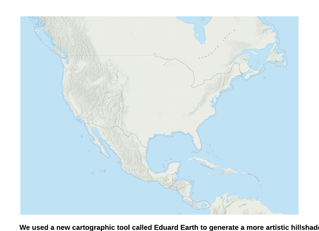
To do this we first rebuilt the hillshade using the Eduard Earth tool for lower zoom levels. This gave us an almost hand-drawn appearance of the terrain and really accentuated it.
Next we rebuilt the hillshade for other zoom levels, leveraging more detailed elevation tiles at the highest zooms to give us a more detailed representation of the terrain
Without Update:
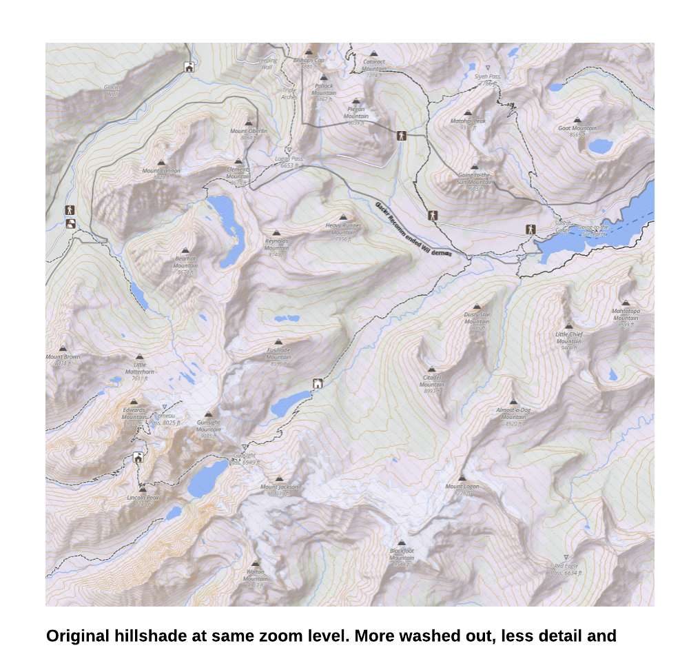
With Update:
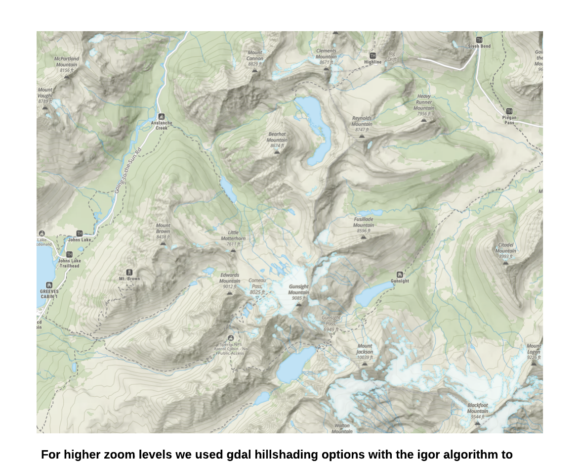
Finally, we emphasized the importance of the tree cover and applied darker contours with less opacity to really allow our new hillshade to come to life while still giving the user of the map the detailed contour information that is so important in a topographic map
Fourth Step: The Aerial/Hybrid Redesign
Much of the aerial / hybrid basemap design is more or less a dark variant of the topo map. We kept a lot of the same design principles such as less emphasis on color for the transportation network, and maintaining the same visual hierarchy of the trail products. There are a couple of primary design changes that are worth focusing on.
Recreation Points of Interest for Aerial
By leveraging our new font based map symbols, we can create styling for points of interest that are designed to work specifically for an aerial background. This allows the symbols to blend more easily with the overall look and feel of the map and ultimately become much more legible. Since the symbols are essentially fonts, we can pick the fill and halo color and have that automatically change when the user selects the aerial or hybrid map from the topo map.
Contours on a Hybrid Basemap
Contours for a hybrid basemap present a very interesting design challenge. The colors of satellite and aerial imagery change dramatically based on the landscape. No single color option works everywhere. White contours would be lost in a snowy landscape, black contours disappear in dark densely forested terrain and everything in between is possible.
We also didn’t want the contours to completely obscure the imagery below it. Our current bright orange contours can completely hide the imagery in steep terrain. We wanted to strike a balance where the contours left the terrain clearly visible while also accentuating the topography.
To do this, we essentially used two different contour colors offset from each other. One lighter and one darker..in darker imagery the lighter contours visibly show and in lighter imagery the dark contours come through. We were careful to find the right balance of contour strength and opacity so the imagery was not obscured beneath.
Taken as a whole our cartographic redesign was a long process but one we are extremely proud of. At onX Backcountry we pride ourselves on always innovating and bringing the best mapping experience to our customers to get them outside doing what they love most. Our new redesigned cartographic experience will help onX Backcountry customers do just that! Check it out for yourself.